 | There is officially one month until I leave for my incredible journey to the UK and into the world of children's book illustration! I was recently sent some new information for the course including quite a few maps, a supply list, and a pre-assignment. Before I set off for Cambridge I first have to get some supplies, mostly paper and paint brushes. I will admit though, I had to look up what A3, A4, & A5 paper was. It is apparently distinct sizes of paper and must be particular to the metric system because in inches it just makes no sense. Nevertheless, I will be stocking up on weirdly sized paper for my trip and some large paintbrushes. My current largest is only about half an inch wide and that A3 paper is about 11x17; half an inch just isn't going to cut it. Secondly, I have to write a story, 500 words, nothing too finalized but with a strong concept, to base my children's book illustrations off of. Over past few months I've taken up writing and quite enjoy it; though my stories are much longer than 500 words. It will be fun to do something simpler, though I'm not sure it will be any easier. I'm so excited to set off on this adventure! |
|
0 Comments

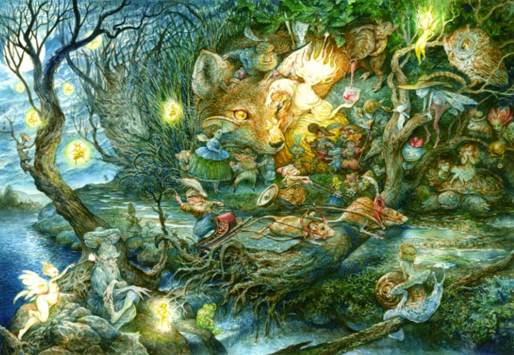 This lovely piece, Night at the Races by Omar Rayyan, was nominated for an award at Spectrum. I just had to pick up a print for myself! We also met a new artist this year, Karen Ann Hollingsworth. Our eyes were originally drawn to what she calls "intuitive watercolor". Her work is gorgeous and vibrant just like herself. We spent a long time talking with her about her work, technique, and ambitions. Her excitement for art and creation was inspiring and made me want to immediately break out the watercolors and try out some intuitive painting. 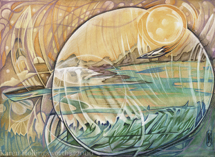 Here's the haul from this weekend! Can't wait for next year! 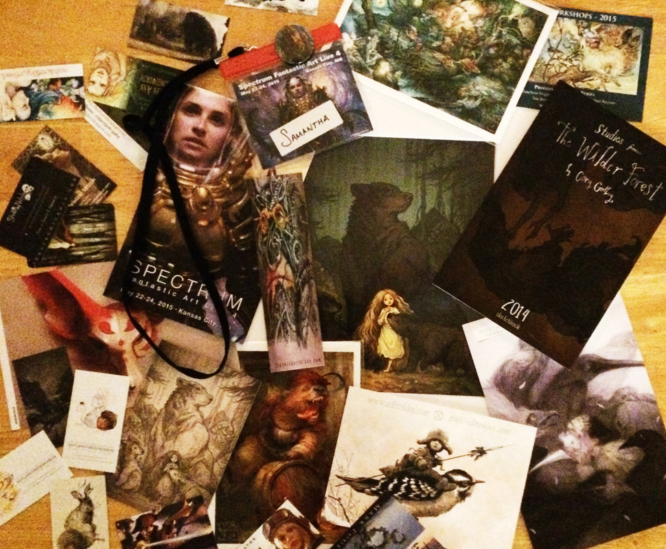
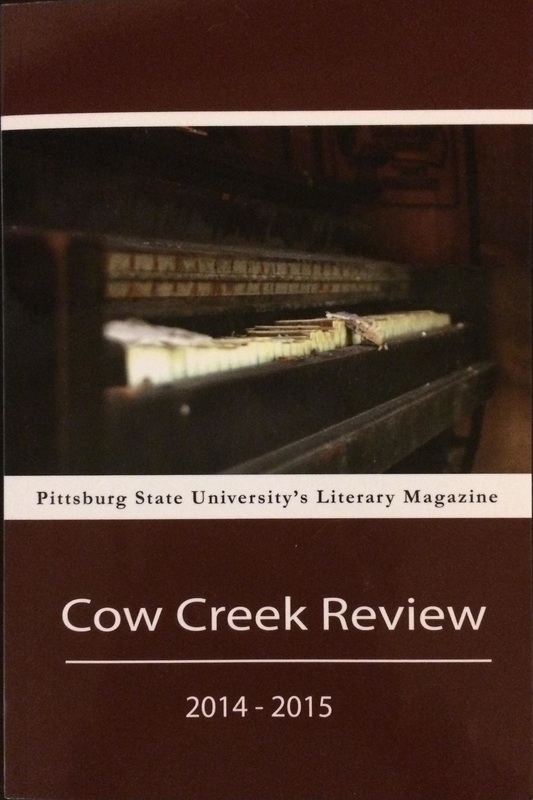
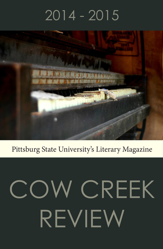
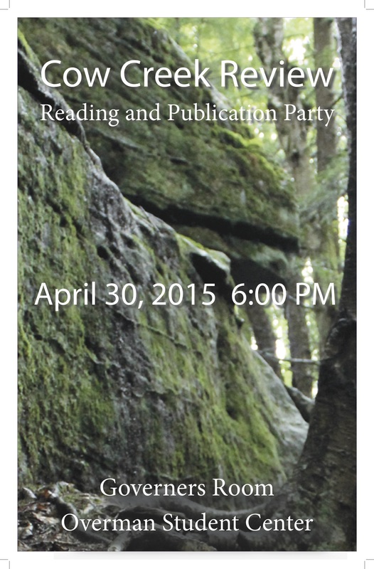
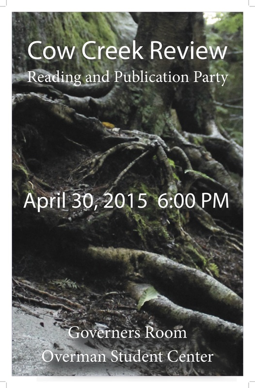
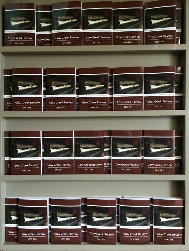
Over the past few months I've had the opportunity to work as the Art Editor for Cow Creek Review. It has been a whirlwind of events but finally the magazine is published and on the shelves. If you find yourself on campus in Grubbs, Porter, Whitesitt, or the Overman Center be sure to grab a copy of the 2014-2015 edition of Cow Creek Review. Here's an overview of the work I've done this semester, as Art Editor, to help get this magazine published: Submission posters
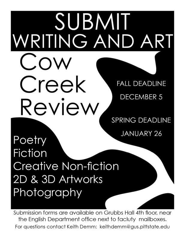
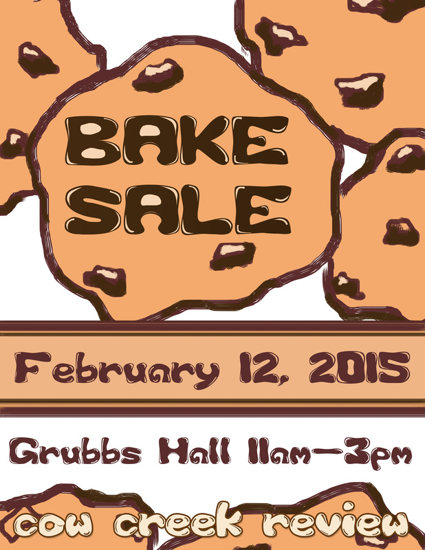
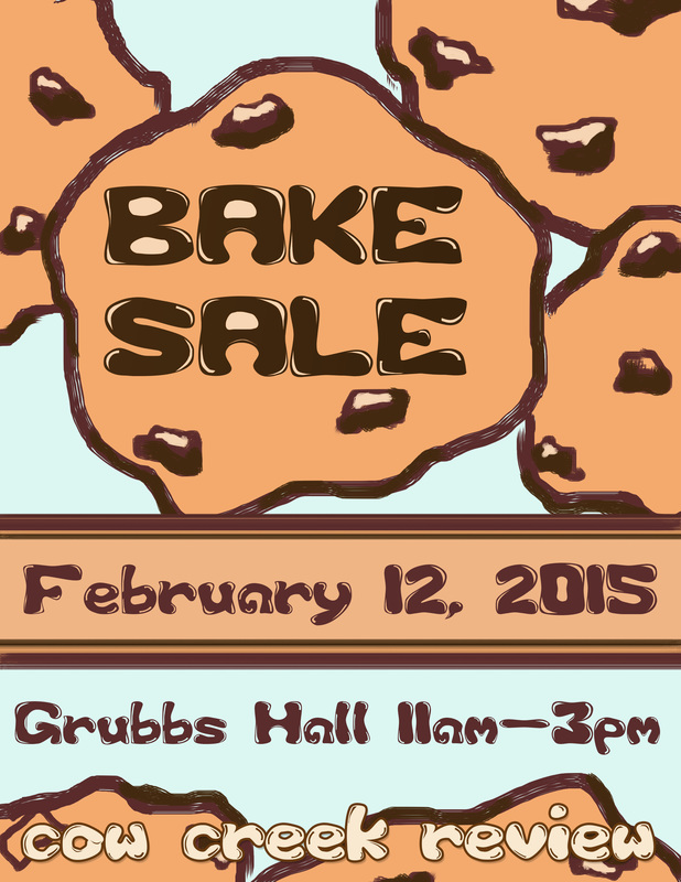
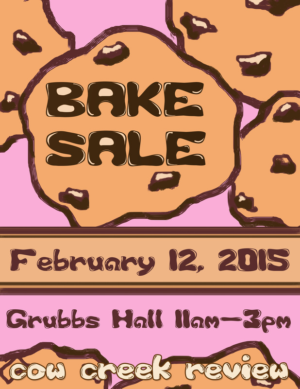
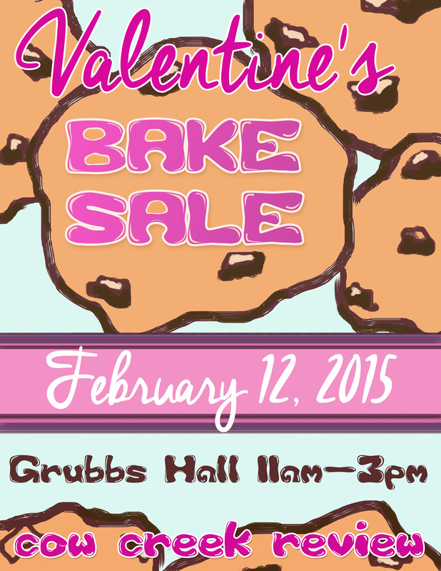
In our meeting I was asked to design the poster at 8.5"x11" for ease of printing. After designing the poster I sent a low resolution .jpg to Dr. Anderson by mail as a proof. Unfortunately he decided he liked it and without getting a higher quality file took it to print. Additionally he blew it up to 11"x17"so the end result had a lot of pixelation around the edges. No one else seemed to mind, but I learned from then out to sent print quality files every time, even if they were just proofs. Bake sale postersEvery year Cow Creek hosts a bake sale to help raise funds for publishing the magazine and hosting the publication party. I designed a flyer for the event. Initially I designed a basic bake sale poster but because it was being held near Valentines Day I was asked to add some love. Thus, I added some extra pink and a script font for "Valentine's". The final poster looked pretty great, though I still preferred those that weren't themed. The end result of a black, white, and pink version was actually a misstep in Photoshop that turned into a happy accident.
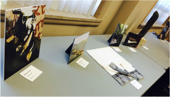
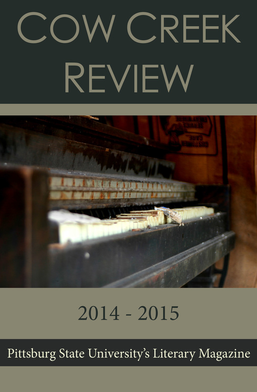
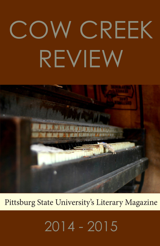
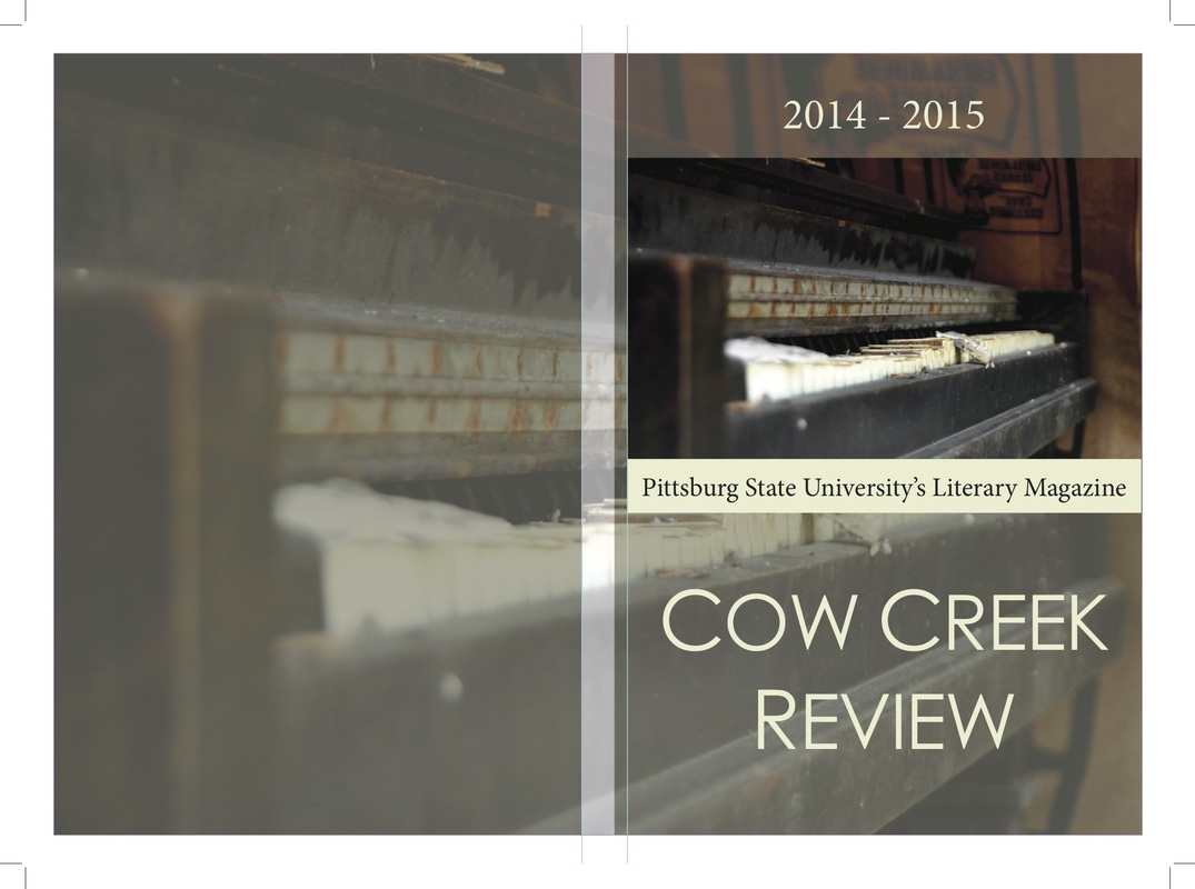
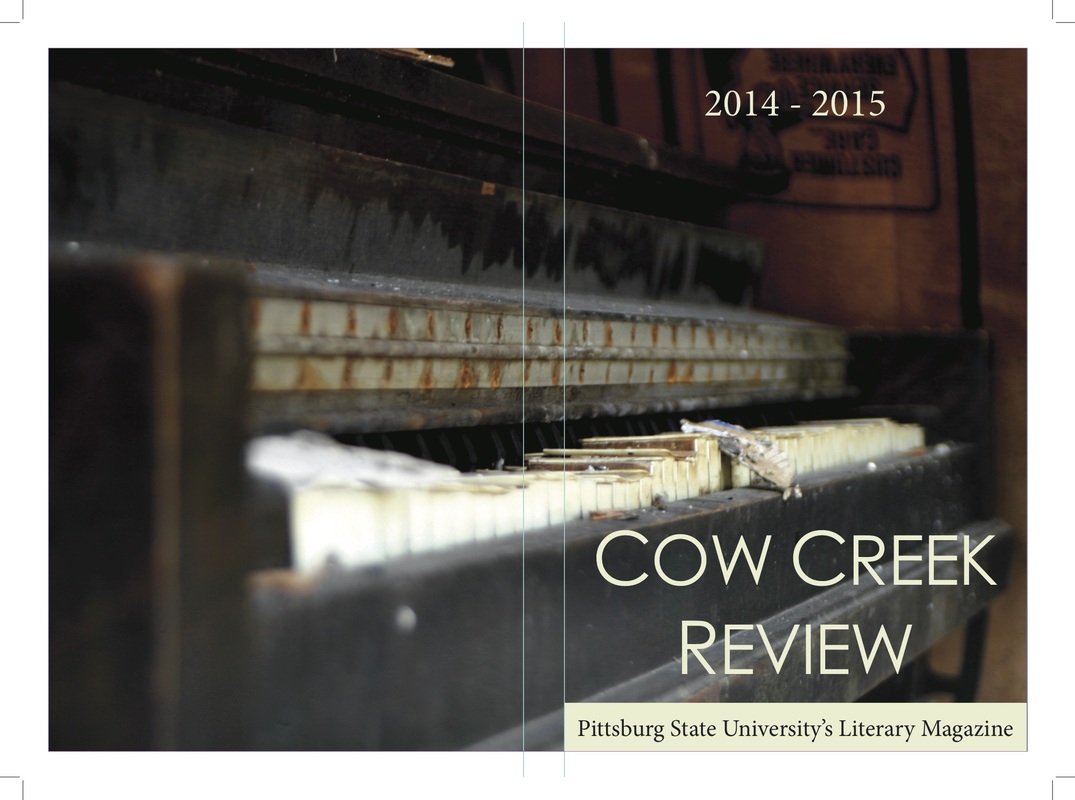
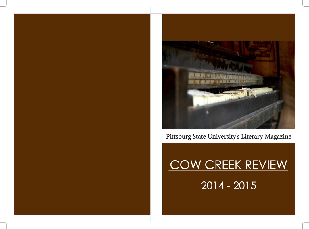
artwork selectionBefore we judged the artwork I gave a short presentation over what to look for in artwork, the basic good and bad. It was a short powerpoint covering composition, lighting, digital manipulation, color and value, and so on. Overall the group did really great at judging the artwork and we came out with a really solid selection of pieces. These are the pieces that made it into this year's edition: Cover DesignWe selected Liz Spencer's piece "The Day the Music Stopped" as our cover image by unanimous vote and the image looks great!
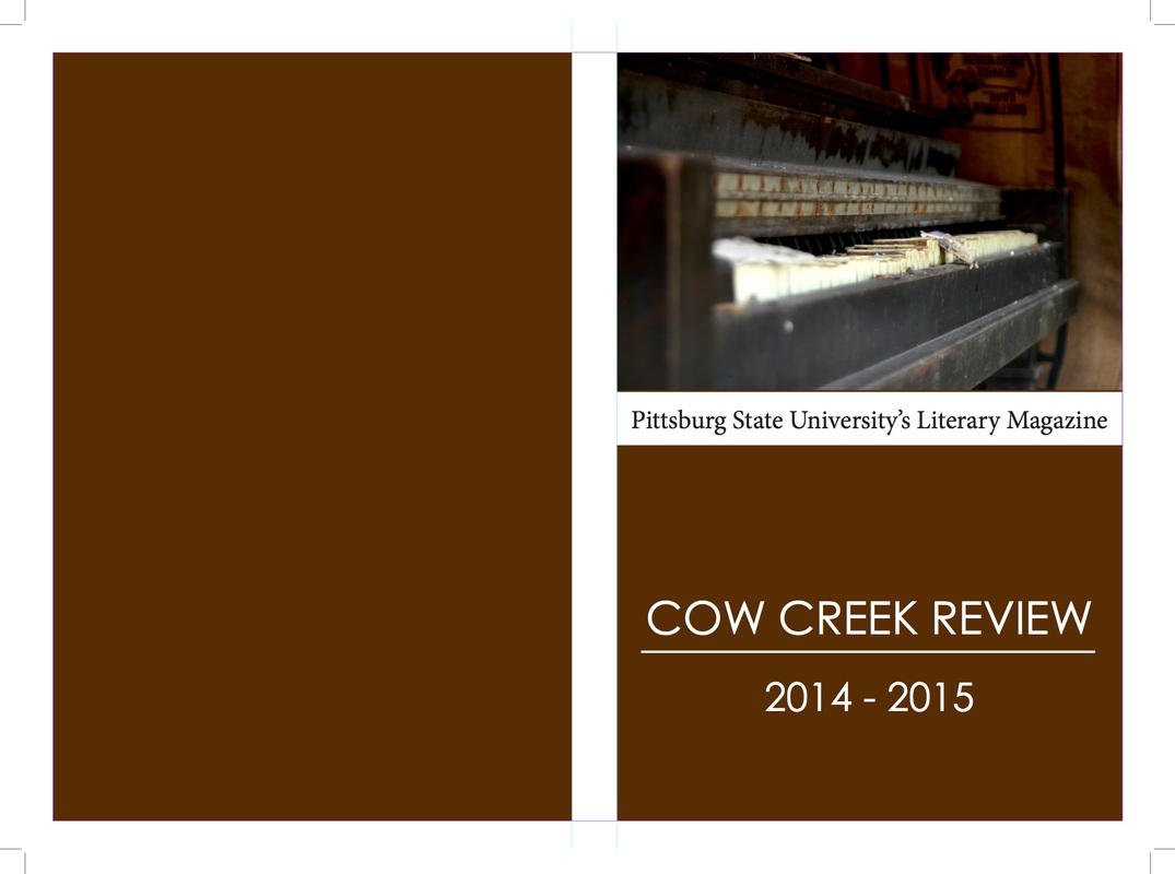
When I first began the cover design process I took my cues from the style of covers used over the last couple of years. The first covers I made were not the exact same layout but were obviously reminiscent of the style. I drew colors from the image itself to create background and text colors. The second type of cover I designed toyed with the idea of a wrap around image for the cover. I didn't care much for the watermarked style but I thought the full wrap around image was very striking. Although the design was gorgeous and very popular amongst the group the ultimate decision was that it strayed to much from the previous designs of the magazine. In the end publication consistency won out and I must admit I was disappointed.
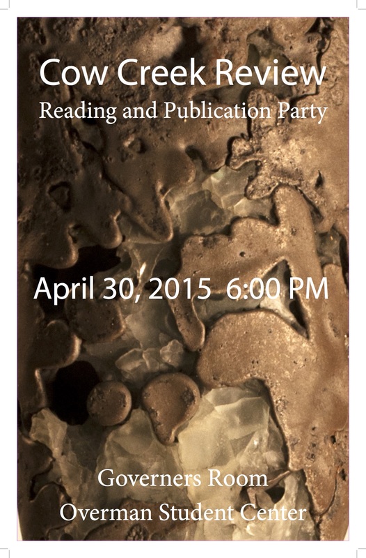
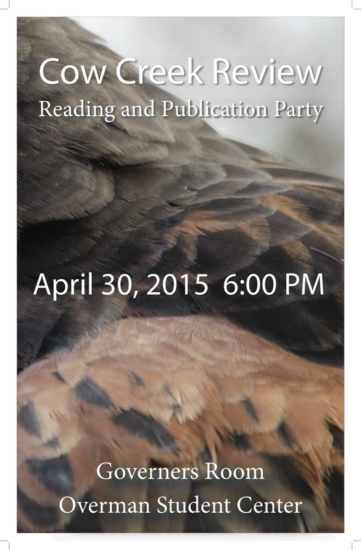
Everyone agreed that the red color for a background was more striking than the grey or green and so I went on to design a couple with that color. I was asked to replicate the previous years cover exactly while just using a different background color and image. I was a little disappointed to have such a lack of creative freedom, especially after having spent so much time on the earlier designs, but I understand why they want consistency in the covers from year to year. Though I understood the request, I knew immediately that the exact format would not work because of the dimensions of our cover image. It was squished to the top and the cover just looked a bit disproportionate. To compensate I added a red bar over the top of the image to lower it and in the end we have a very nice cover. 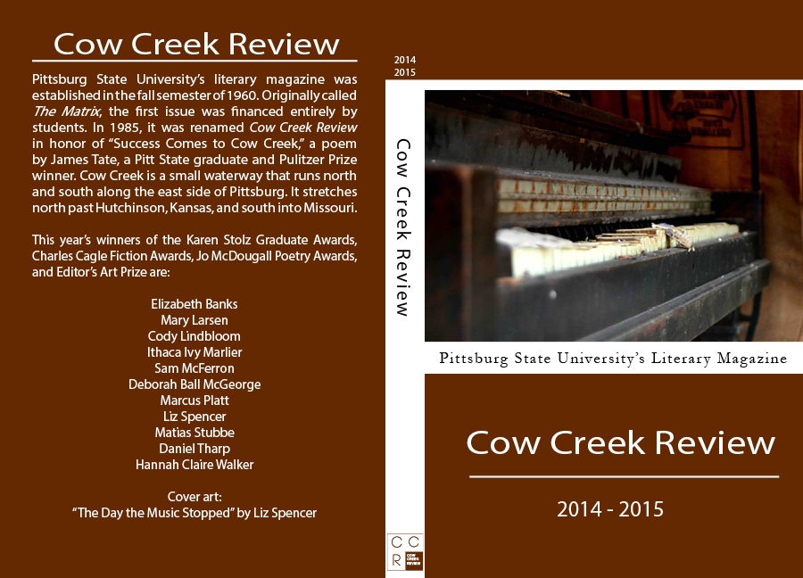 Publication Party PostersAs a bit of a teaser I created a few publication posters that were zoomed in pieces of some of our accepted artwork. They look great but Kenneth Andrew's "Armature" zoom-in was by far my favorite poster and just a really interesting piece of sculpture.
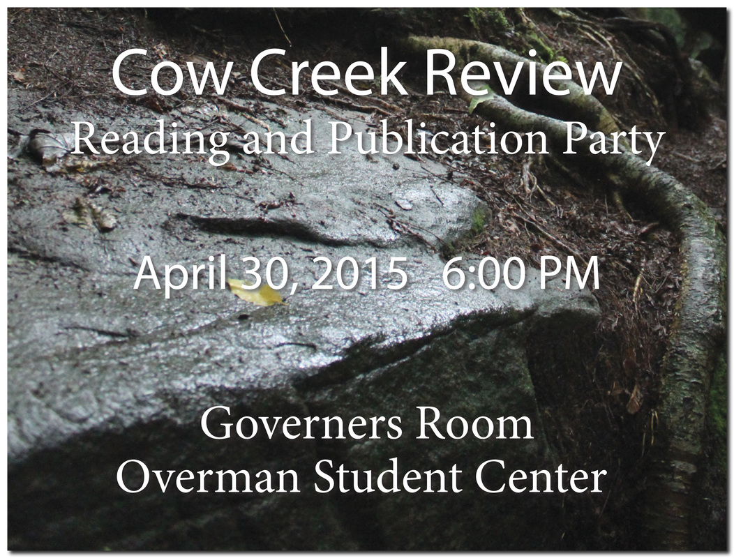 The image above was made to show on the TV in the Overman Student Center to publicize the publication party. Publication party
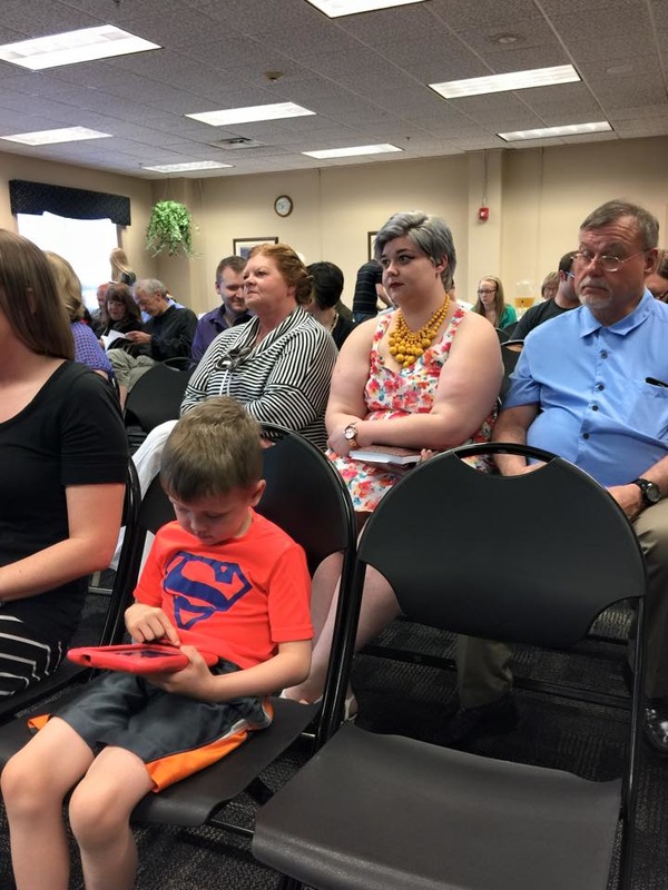
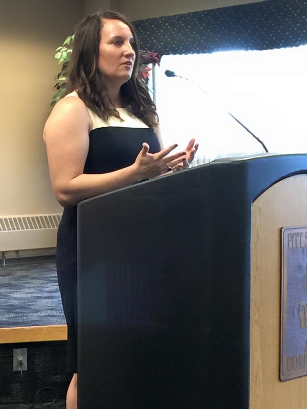
 The publication party was a hit! We had a nice turn out for the party, the new magazine looks fantastic, all the authors did a fabulous job reading their pieces, and the artwork looked great. We even got a chance to hear from Liz Spencer who won the Editor's Art Prize for her piece "Dementia" and whose piece was on the cover of this years edition. She explained about her mother's diagnosis of early onset alzheimer's and how it influenced her piece "Dementia". She also talked about taking the image of the piano on our cover the days after the Joplin tornado and how it was left standing behind a single wall that remained of a destroyed house. The evening was a wonderful meld of creative minds all appreciating each other's works. THE 2015 EDITION IS ON THE SHELVES NOW! |


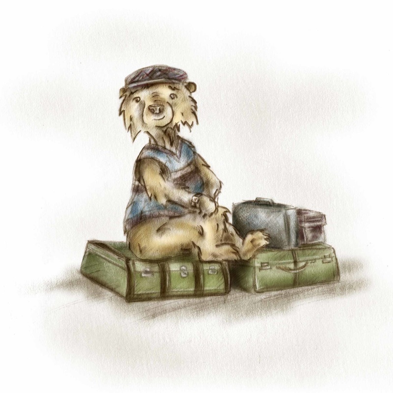 | I've signed up to go study at Anglia Ruskin in Cambridge for a week! For one week at the end of July, I will make my first international flight and attend a 6 day "short course" for Children's Book Illustration. It's going to be a busy week but I expect to learn a lot of great things! Some details for the workshop can be found here: http://www.anglia.ac.uk/study/professional-and-short-courses/childrens-book-illustration-summer-school |
